For the majority of my career as a designer, I’ve been trying to figure out what my unique style or approach is. You know, the thing that differentiates you from other designers and the special sauce that you add to work because you specifically worked on it. Early in my career when I was at an agency, I would see my peer designers develop and refine their aesthetic over time. I got to know their taste so well that when anyone pulled up a mock of an app from one of our many projects, I would instantly be able to tell which designer at the agency worked on it without needing to be told. I could tell just by the choice of using stylized illustrations or the intentional pairing of a serif typeface for headers with a monospaced sans-serif for body copy. I would know that an overall loud and frenzy aesthetic was one designer’s preference whereas a quiet and subdued design was another’s.
What kept me up at night in those early days is that I didn’t know what my own style was. What was it that I was adding to my designs that uniquely identified it with my stamp and signature? Would my fellow designers be able to tell that it was me who worked on it? This was driving me nuts, so I asked one of them. They said that my aesthetic is one defined by focus, minimalism, and clean design. I thought to myself “Hmm, ok, but that’s very broad and generic. They’re probably just saying it to be nice.” I then literally spent that entire night going through my entire body of work and creating a moodboard with it trying to come up with names for my visual language. And I couldn’t do it. So much of the work was shaped and molded by client feedback or others’ opinions that the end products didn’t really feel like it had any ounce of me in it. I wanted the work to solve specific problems, and I left it at that. I thought that anything excess I added which imbued a bit of my own personal aesthetic in my work went against the goals of the project.
And that was it. That last thought right there was what led me to discover my own design philosophy. It was vague and loose at the time, but time brought clarity to this. My unique stamp is to keep the design so brutally minimal that it shines a light on the most important things and detracts attention away from the less important ones. I later discovered that there’s a word for this: essentialism. It’s the quiet act of stripping away all the complexity and confusion out of an experience and preserving just the most important bits. This is an art form, and one that requires careful consideration of the problem, the user, the product, the goal, and the solution. Anything that gets in the way of this gets thrown out, and every pixel had to earn its place on the screen. Every color, every gradient, every word and letter describing something, and every shadow offset needed to have meaning and purpose. I would often not use design systems and create one-off stuff from scratch because I could use things like corner radius and baseline heights more intentionally to serve the needs of my specific project. I would sometimes bend accessibility guidelines or go against best practices to make something stand out more.
In a world where everything calls for our attention, the most pleasant experiences are the ones that don’t require any focus or effort at all. They seamlessly blend into your life without you needing to think about them. Doors with correct push-pull affordances in the form of handles or bars, cars that have knobs and dials for operating off of muscle memory rather than sight, and furniture assembly instructions that entirely rely on visuals and no text to communicate information. There is a very intentional omission of an alternative in these experiences. In order to make something feel essentialist, you have to remove friction from the experience. Anything that might be confusing or make a person think twice about engaging with the product must go. I don’t have time for that. I have one microsecond to get you to mentally commit to an action and I’m going to make sure it’s as easy as possible for your mind to make the most intuitive choice.
Often, this means removing all distractions, including aesthetic flourishes. My work is not flashy or striking. It’s simple and subdued to a point where you wouldn’t even consider that it’s an experience that’s been designed and thought through by someone. I like to start with a blank clean slate and be intentional about every single thing I add. Color should only be used when it’s communicating a meaning. Animation should only be used when it’s helping make something clearer or adding context to an action. The main action a user needs to take must always be clear and obvious. These sound like basic design principles, but ask yourself this: if they’re so easy and straightforward, why aren’t we constantly being flooded with products that exemplify and uphold good design from every company out there?
It’s because it’s easy to preach but hard to execute. Companies often have multiple lines of revenue, and they don’t want to promote just one thing as the main action. They want users to have choice and display five actions they could do. This does nothing but add decision fatigue for the user, may of whom will perceive the product as a poorly put together package that doesn’t seem to know what it even stands for. It comes off as a confusing, clunky experience that wants the user to do the work to figure out how to use it rather than actually present a point of view for how it should be used. Essentialism is a risky thing for a company to invest in.
When it’s done right though, the same executives who said it’s too risky will sing praises about how well-designed something they experienced is. They’ll talk about how easy it was to control their Nest thermostat by just turning the dial as they were walking from their kitchen to the bedroom. They’ll remark at how they loved the MagicBands at Disney on their family vacation. They’ll point out how amazing it is that their Tesla just automatically unlocks when they walk up to it and doesn’t need a physical key to be carried around. All of these things were, at one point, risky and insane ideas that were proposed with the goal of reducing friction in an existing experience. Thermostats were messy and unintuitive to operate. The hassle of dealing with credit cards at theme parks was too time-consuming, And the problem of constantly forgetting to grab your car keys is an evergreen issue. These executives know good design when they see it, but can’t mentally picture the path it took to get there. They don’t see the failed prototypes or the dozens of edge cases programmed into the experience to account for fail states and graceful fallbacks, all of which take time and energy and thought into designing for and around them. And then they balk at their own product and complain about how it’s not well designed while at the same time not willing to invest in the time and work it takes to get to a point where the design can meaningfully improve.
Ultimately, this is a failure of capitalist incentive mechanisms and how tech organizations are structured around hitting specific KRs to inflate business metrics. It has less to do with design philosophy and more to do with a fundamental mismatch of the tech industry’s goal is not to design good and useful experiences but instead to increase profits at all costs. It takes a long time for well-designed products to get noticed by the market and build a reputation. People need to get accustomed to using and living with a product. Perhaps the Achilles heel of the essentialist philosophy is that when you do your job right, the products simply disappear into a user’s life and they never actively acknowledge their existence. No one complains and no one praises. Good design is invisible. The best design is so well integrated into your life that you forget that it was designed at all.
• • •
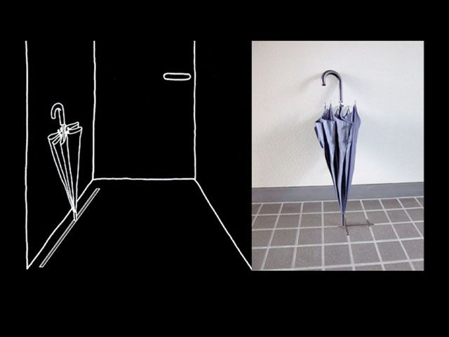
Naoto Fukasawa, who designed several iconic products for Muji, had proposed the sketch on the left above as an example of design that blends into a user’s life. A person’s instinct when arriving home is to put the umbrella down or pick it up as they’re leaving. The problem is that constantly slides off the floor, so you awkwardly anchor it against something or designate some random nook by your entrance the umbrella rest. Fukasawa’s solution simply lets the user do what they naturally would by allowing them to accomplish the task as they naturally would by allowing the umbrella to lean against a small groove in the floor. The design isn’t even really visible unless you know what to look for. The phrase that his colleagues had for this philosophy is “Without a thought,” which Fukasawa turned into an exhibition and countless books demonstrating the philosophy.
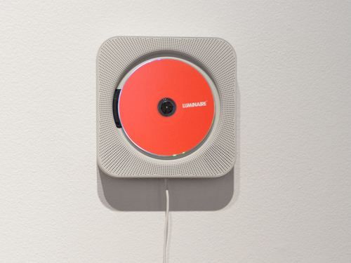
Fukasawa’s CD player is one of Muji’s most iconic products. It’s dead simple: a rounded square with speakers all over and a slot for a CD in the middle. It has a pull cord, which beckons users to interact with it the same way you would with a fan or a wall-mounted heater in Japan. And when you do, you’re rewarded with the physical sensation of a spinning CD and music instantly playing. Pull the cord again to stop it. That’s it. This requires no Play or Pause buttons, no labels, no manuals, and no “Insert disc here” prompt. It’s so intuitive and obvious to anyone that it removes all friction from the moment you think about wanting to listen to music to the moment that it begins playing. The entire mental steps are shortened to “pull the cord.” And note the intentional choice to not overload the main interaction with buttons to control volume, fast forward, or skip. These controls still exist, but they’re just accessible from the top of the player, not the front where they could add more decision fatigue.
• • •
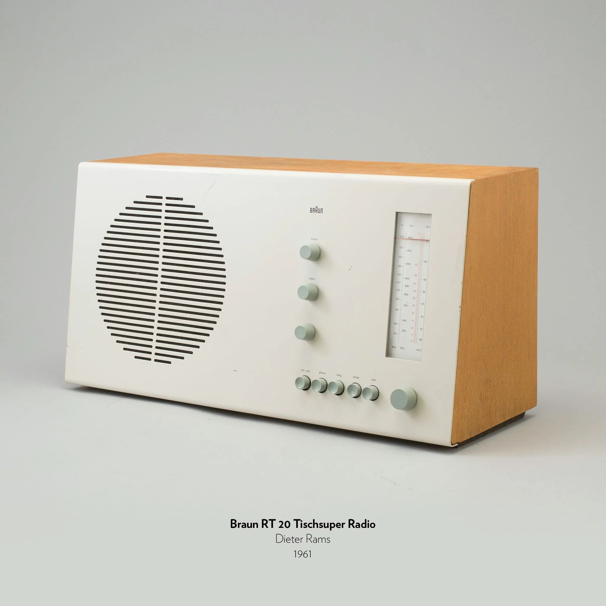
Perhaps my favorite and most influential example of who I consider to be the designer who most exemplifies this philosophy of essentialism is Dieter Rams. Throughout his tenure at Braun, Rams worked on dozens of products from radios to toaster ovens to calculators, all of which had a core philosophy of the product doing as little as possible to execute its function. Less, but better is one of the most famous quotes from Rams, and he really imbued it into every product he touched.
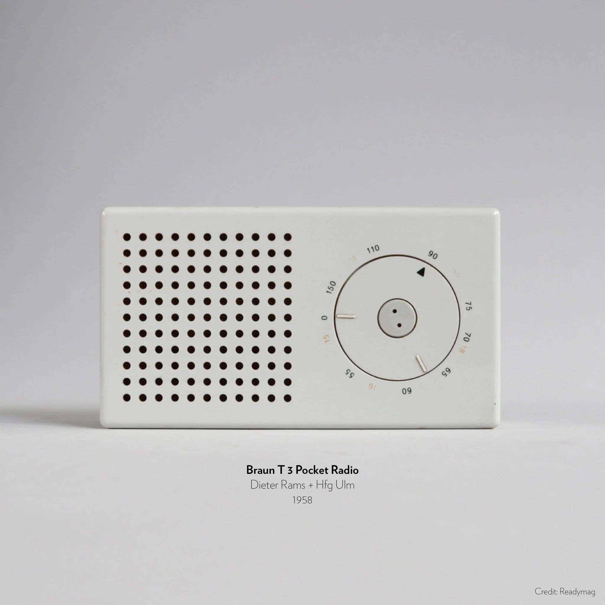
What strikes me most about Rams’ massive portfolio of work is that he is able to make his essentialist work also stand out with excellent use of visual and industrial design principles. By removing the distractions of color, feature bloat, and multiple buttons to interact with, he is able to prioritize the form, shape, proportions, and overall gestalt of the product by emphasizing the spatial relationships between controls in a uniquely distinctive way. This is his stamp. You’re only going to see a few buttons on this radio, and the rest of the space will be empty. No branding, no labels, nothing. The most important stuff is the stuff that’s on there. Your mind won’t be filled with decisions and thoughts about what to do next or how to use the product. You’ll instinctively know what to do.
There is a deep and considered aesthetic sensibility at play here. Rams uses his expertise of three-dimensional forms and creates a canvas for a product to exist in by carefully harmonizing all the different aspects of good product design. His signature style is on full display with his work. When you see a 1960s Braun product, you know exactly what it is and what you can do with it even if you’ve never seen or used that product. Even just by looking at an image of a product, you can tell what features it likely has and more critically, which ones it doesn’t. Can you say the same for any piece of digital software today?
One of Rams’ Ten Principles for Good Design, and my favorite, is “Good design is as little design as possible,” a philosophy that’s easily visible on everything he has worked on in his career. He held the belief that people overcomplicated products and that we’d be better off living simple lives with products that were really well-built to do the thing that they were made to do. I wholeheartedly agree. In an era where we seem to be constantly cramming more and more features into every single thing to get our eyeballs to pay attention, Rams’ work embodies a philosophy that we desperately need to work our way back towards.
• • •
Every product we design has functional, emotional, and psychological requirements that need to be met. A PM at a tech company will largely ignore the latter two in favor of making sure the functional needs are met. They’ll rush out a product that barely works, has a few bugs, and doesn’t really give users a reason to use it. They’ll then run focus groups on why people don’t love their product and put together a 20-page brief on how they’re going to win back users. Meanwhile, Braun products are literally passed down from generation to generation because they last forever and are incredibly well made. Users have formed such strong emotional attachments to them and it fulfills such core psychological needs for understanding and operating objects in our built environment that owning a Braun product fills people with pride. Pride that someone cared and deeply thought about how a blender should not only be used, but also what the most important parts of it that they’d need to use most are. Pride that it not only works well but also lasts forever and looks stunning on their kitchen countertop.
The thing I’ve struggled with most in my work with integrating this philosophy in my work is the aesthetic portion. I can create pleasing and satisfying compositions, sure, but they often feel like I’m re-arranging things that don’t even make sense as components in the first place. I fight to get features removed or killed that aren’t adding anything meaningful to the experience and make a case for focusing on the most important things. What usually tends to happen is that my essentialist ambitions get diluted into some half-realized version where the pieces of the grander vision are visible but were clearly stonewalled by some corporate regulation or are still being tested by a risk-averse team with low conviction in the ideas.
And I’m fine with that. It means that there’s still work to be done. It means that I haven’t yet figured out how to ship a truly essentialist experience that actually embodies my values and one that I’m personally proud of. I have yet to see a product I designed go out into the work that I can look at in its whole and say “Yes, that’s as little design as possible.” I haven’t yet reduced an experience down to its core components to such a degree that all the friction and cruft has disappeared from it. But I’ll keep striving to do it until I make it happen. At every stage of my design career, I have felt myself get closer and closer to that ideal vision. And I’ll keep trying to embed this philosophy in everything I work on as my own personal stamp in everything I touch.