I was the lead designer on this project heading strategy, stakeholder reviews, and XFN alignment. I had 2 Design ICs working with me that I mentored through various phases of the project and collaborated with our Design Systems team to work on the brand assets and illustrations. We did the core design work in a span of 10-12 weeks, with several follow-up rounds for experiments and rollouts.
Background
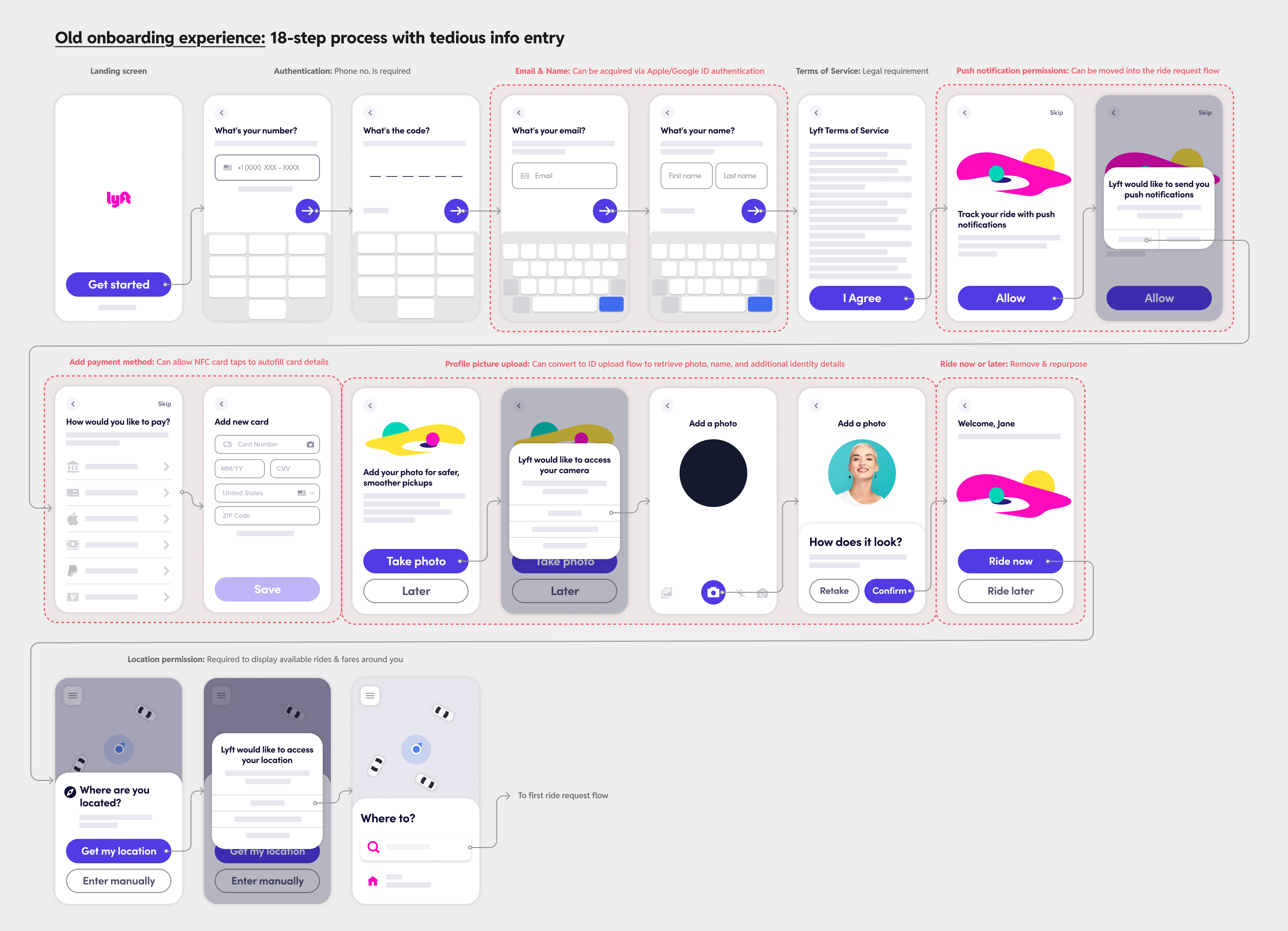
Nearly half of all Lyft riders who go through the process of creating an account never take their first ride. Lyft’s rider onboarding flow was seeing a big dropoff at the payment method step and another big dropoff the profoile photo upload step (despite it being optional).This signaled to us that we could be doing a lot more to streamline and simplify our onboarding funnel and leverage it as a branded experience to get you to take your first ride after signup.
Most new riders downloaded the Lyft app in situations where they urgently needed a ride, like getting from the airport to their hotel or to quickly to get to a sports/concert venue in time for the event. In these contexts, every point of friction that got in the way of you deciding to download the Lyft app and check the prices to actually getting into that ride was an annoying irritation. My goal was to find ways to reduce this friction while introducing Lyft’s brand and voice into the flow.
Reducing friction in the flow
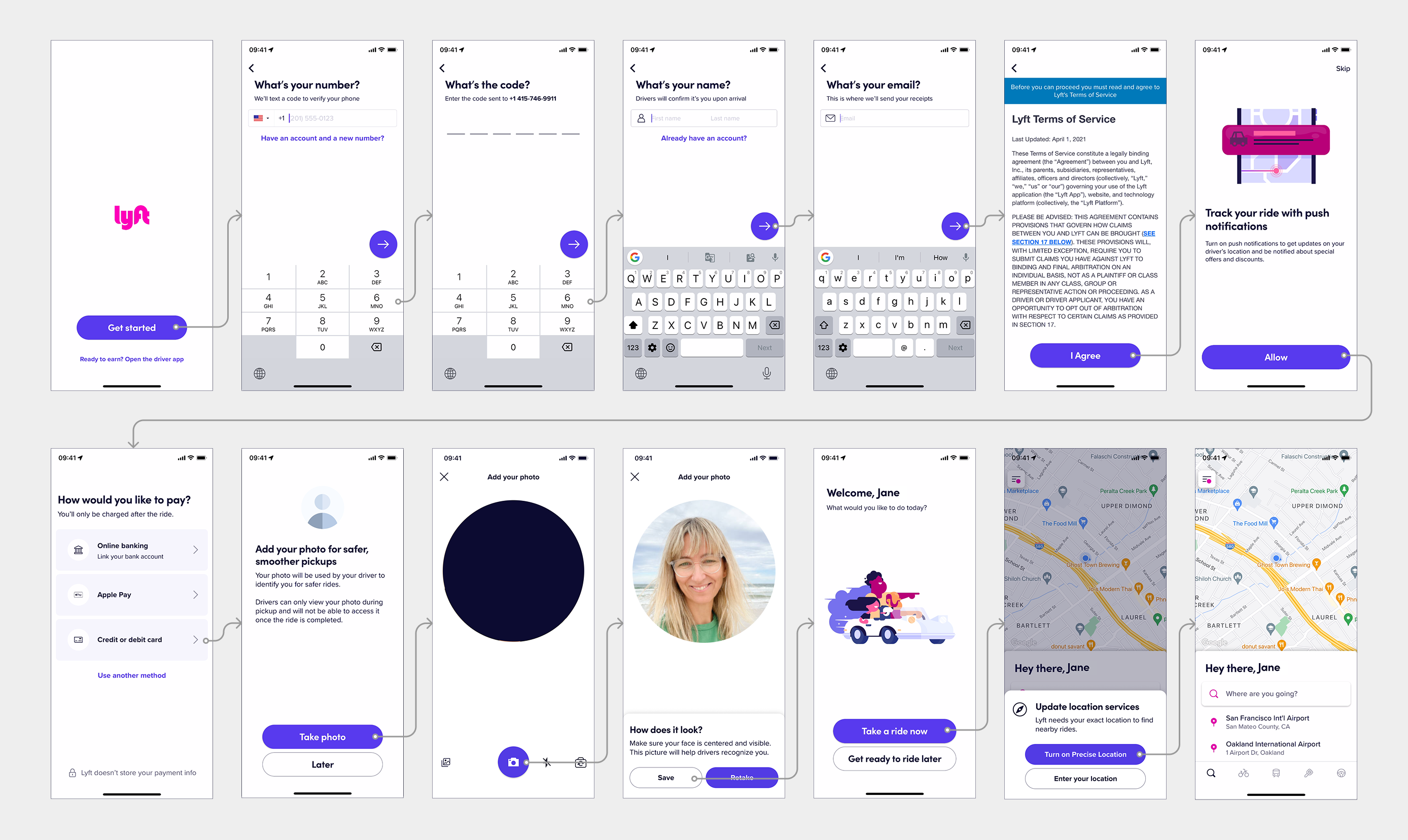
I laid out our full onboarding flow, complete with permission prompts and branching flows, using low-fidelity mocks to better evaluate the overall flows without getting bogged down by the UI details (shout out to Alex Savard for creating the amazing library for all of Lyft Design to use). I used this as a base template to lead a brainstorm with the working team and identify opportunities to reduce friction in the flow.
The most promising ideas from the brainstorm were to move non-critical steps out of the onboarding flow and automate or pre-fill as much of the information as we could. We began investing in and building out these core capabilities like adding Apple ID or Google authentication to automatically fetch name and email or investing in an ID scanning flow to extract the profile picture from it.
I wanted to push this even further and proposed that we move the steps to the touchpoints where they’re most relevant. For example, we would only ask for a payment method once you’ve decided to book a ride, increasing conversion on that step because the intent to book a ride is already present. This also lets us get users to the homescreen immediately after authentication.
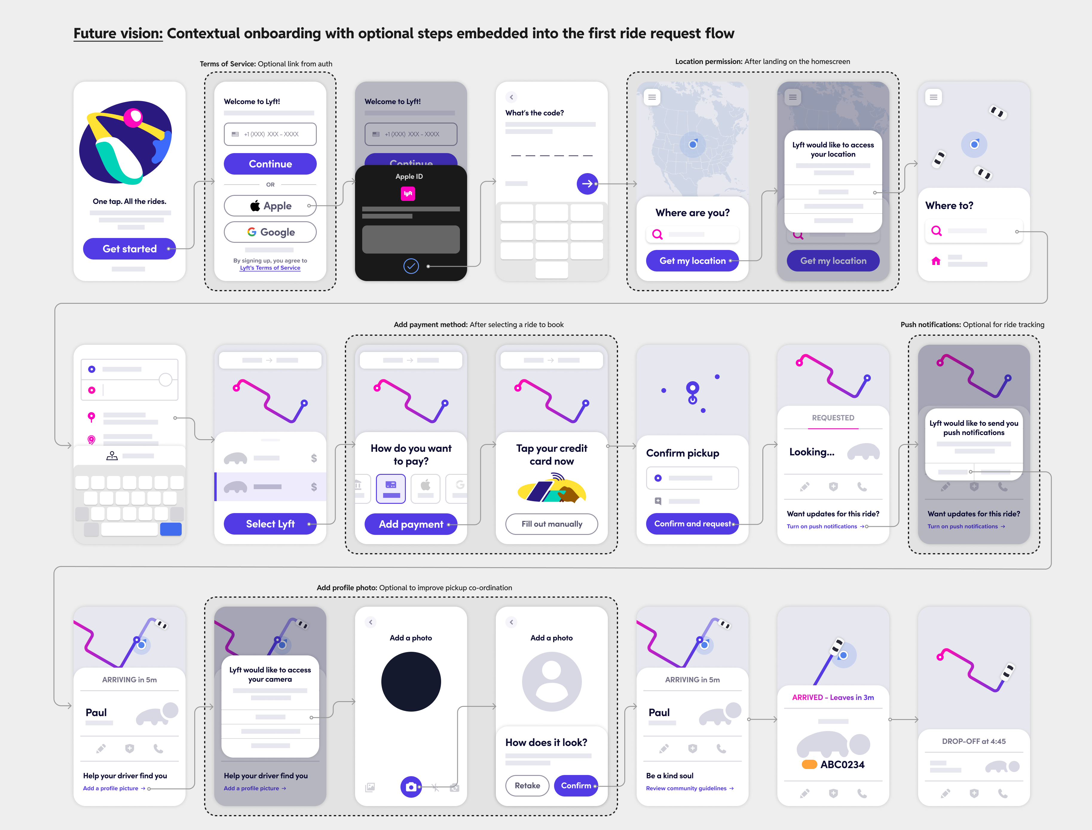
A lot of the information we ask for in onboarding is required to get into a Lyft ride, but not all of it is really needed to get to the main homescreen. This concept landed really well in leadership reviews and spun off an entirely different workstream to tackle the price-checking use case separately as an experiment on top of our onboarding revamp.
So for the short-term revamp, I kept the flow as one sequential onboarding experience while keeping our proposed improvements like auto-filling credit card info by detecting the NFC chip on the card, which not only sped up the flow at the point with the highest dropoff rate but also reduced error rates by eliminating typos.
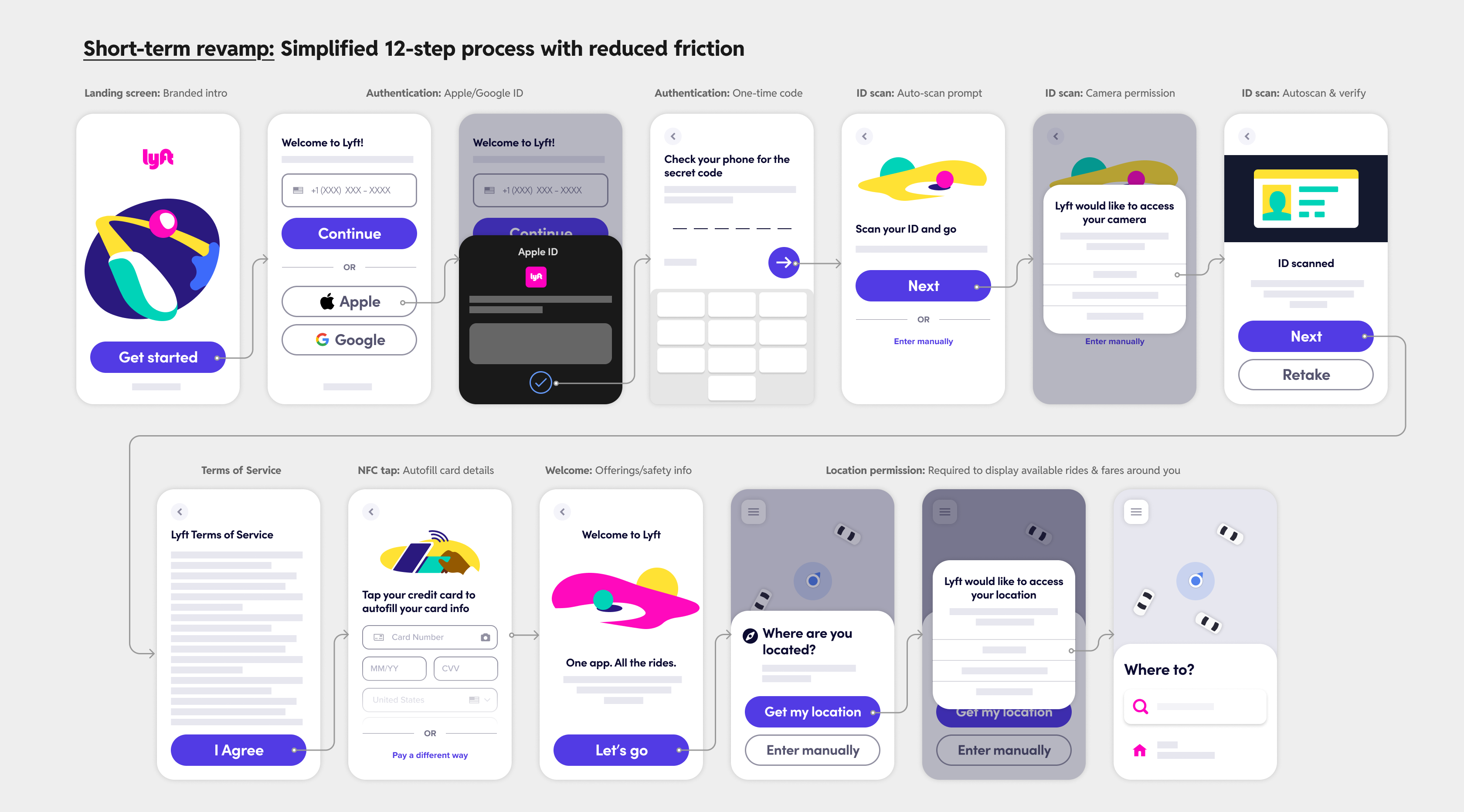
I also felt it was appropriate to ask users if they wanted to upload a picture of their ID instead of take a picture of themselves on the spot. In the high-stress urgent scenarios that we knew people downloaded the Lyft app, they probably didn’t look their best or simply aren’t in the mood to take a selfie of themselves. We would then retrieve their photo from their ID, loading in a clean headshot of themselves that was taken at a moment when they were actually prepared for it. This also doubled as a way for us to verify the name or store their legal name on their profile by extracting the name from the ID via OCR.
The brand strategy
Contrary to prevailing beliefs in Growth teams, a user’s first interaction with your product is not the signup flow. They form an impression about your product and through the brand they experience in the real world. Maybe a friend told them about the Lyft ride they took, or they saw someone on a Lyft bike, or they just saw an ad. Their expectations for the product experience is already being set by everything they see, hear, and listen to before ever downloading the app.
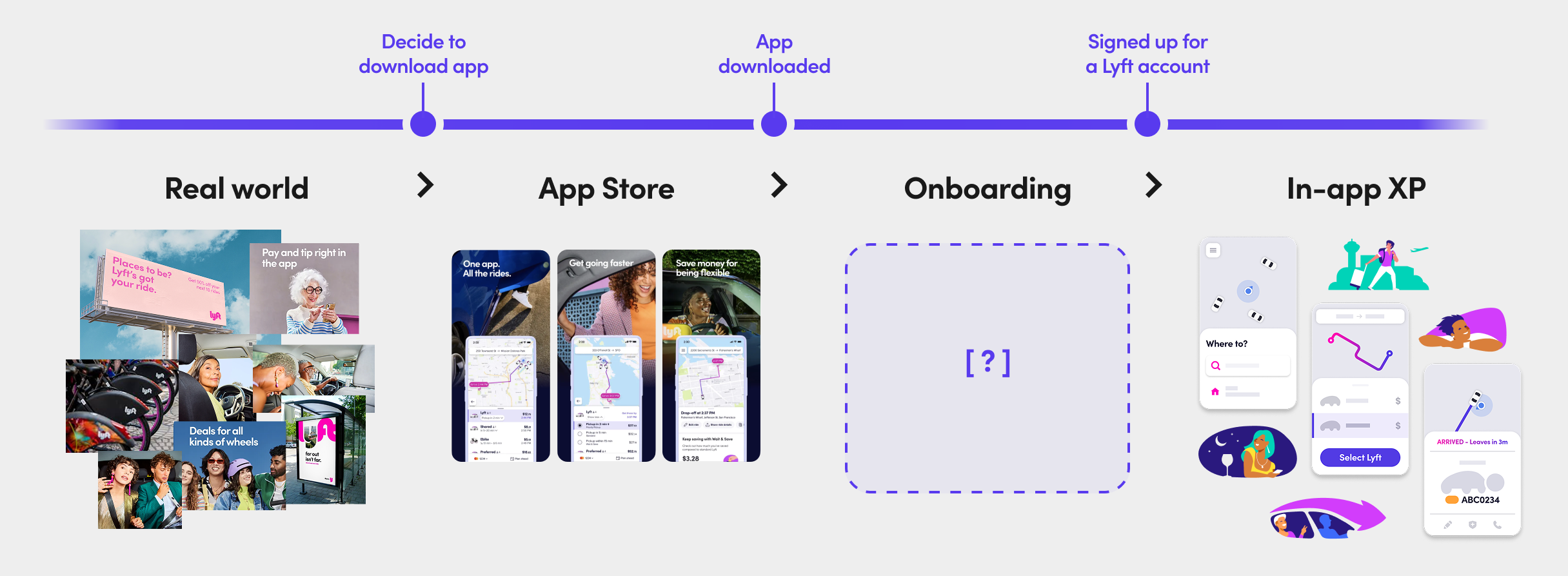
Lyft had a great brand, but its signup flow for riders didn’t. Users went straight from seeing photos and real-life imagery into a product experience that leaned heavily on stylized illustrations and strong brand colors in the UI. I wanted onboarding to be the bridge between these two experiences, serving as a transitionary state that gently introduced the product language as users created their account.
I also wanted to be very intentional about how and when the brand shows up in the onboarding flow. Given the types of urgent scenarios in which riders downloaded the app to call a ride, I felt that this would be a great fit for channeling the psychology of peak moments.
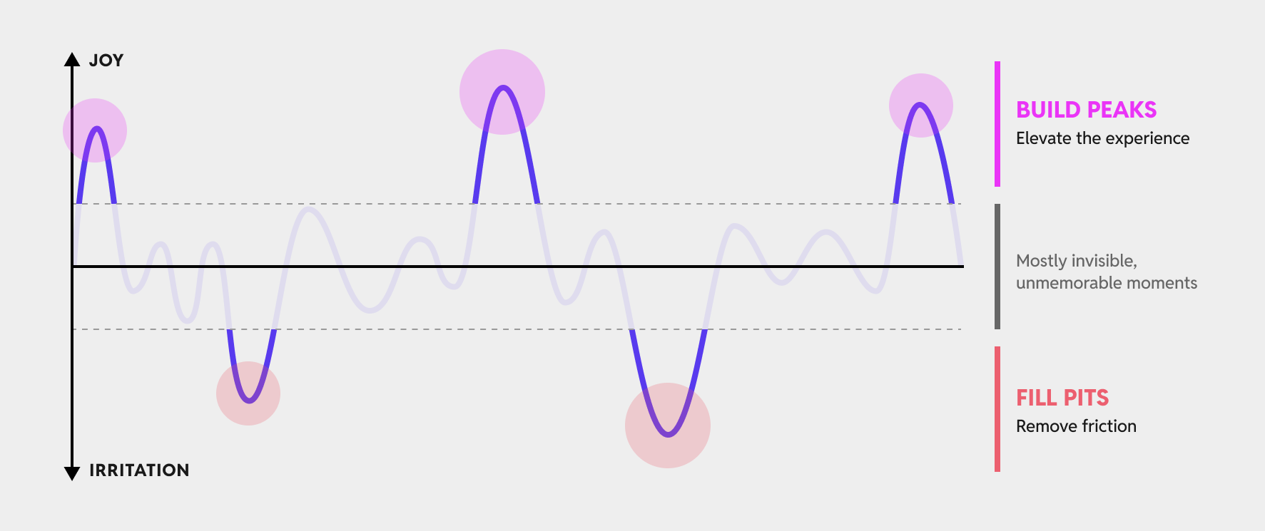
“When we recall an experience, we tend to remember flagship moments: peaks & pits, beginnings & ends”
I wanted the flow to start and end strong with peak moments to create a positive, memorable experience. The automations to speed up the manual data entry would become the invisible, fire-and-forget moments, and all non-critical steps would be eliminated to fill in the pits of the flow.
We didn’t have any peak moments in the old onboarding flow. I truly felt like we were all down in the pits asking users to manually type in tedious information on every single screen. There was no delight and nothing to lift you up as you kept progressing. I wanted to change that.
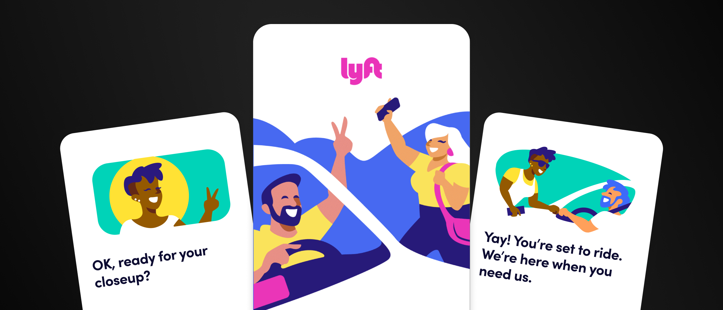
The landing screen and the welcome screen became prime candidates for peak moments. They were the ones with the best opportunity to wow and impress towards the beginning and end, and they were the only screens that didn’t require you to take an action other than just proceeding with the flow. I focused most of my energy addressing the brand in these two surfaces.
The landing screen
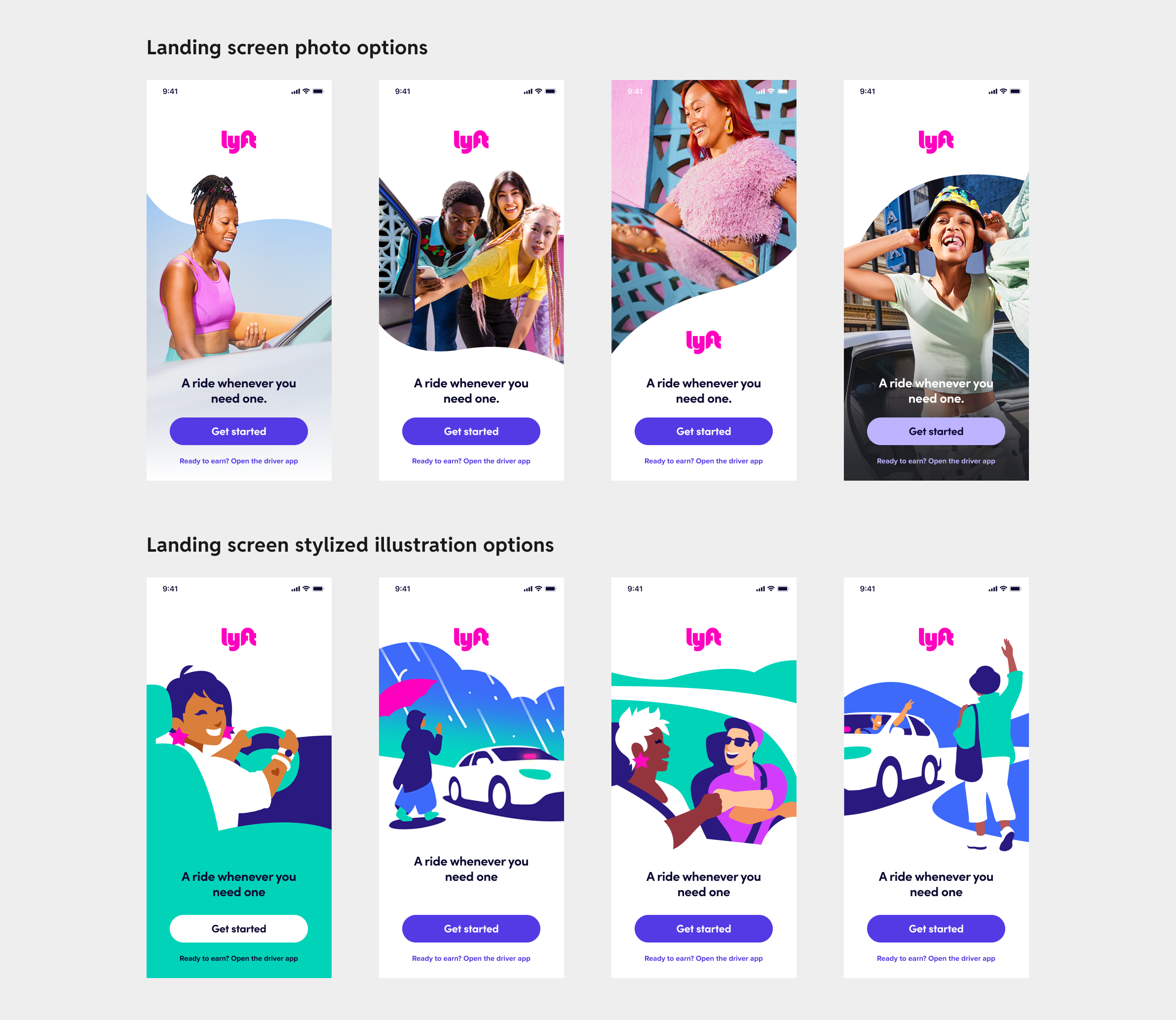
Because the landing screen was supposed to be the bridge the real-world photography and in-app stylized illustrations, we tried both to see what it would feel like. Ultimately, illustrations felt like the better direction because of how expressive they were and the tone they set for the product experience. Shout out to Kevin Kwong and Conor Buckley for the great work on all the stylized illustrations in this project.
“We believe good energy moves the world.” - Lyft brand values
The illustrations were dynamic and energetic in a way that images couldn’t match. We could also be more opinionated about what elements to highlight, and we focused in on the connection between riders and drivers in the moment of being picked up for a Lyft ride. We finally landed on using an animated view that showcased several of these moments in different contexts.
There were loud voices calling for this screen to also be axed in favor of directly displaying the authentication options, but I felt strongly that this was an essential moment to set the tone for Lyft’s brand. Without this, we wouldn’t be able to elevate the experience with a peak moment at the start of the onboarding flow.
The Welcome screen
We had two options to leverage for the second peak moment: either use it as an educational surface to build awareness of Lyft’s product portfolio or use it to reinforce our commitment to safety. Both of these came out of research interviews, and we had to pick one (otherwise it added too many extra steps). I started exploring how we would communicate offerings on the view.
I had to coach every product team at the org to not add swipable carousels explaining their features in-depth on the welcome screen. We really only had 2-3 seconds to get the user excited about Lyft on this screen, so I encouraged everyone to distill the content down to the Awareness layer of education.
For the safety version, I didn’t want this to feel like another wall of text on a screen info-dumping content onto you. We refined this content several times until we landed on a version which positively acknowledged the fact that signup is nearly done and that Lyft had your back if anything were to happen.
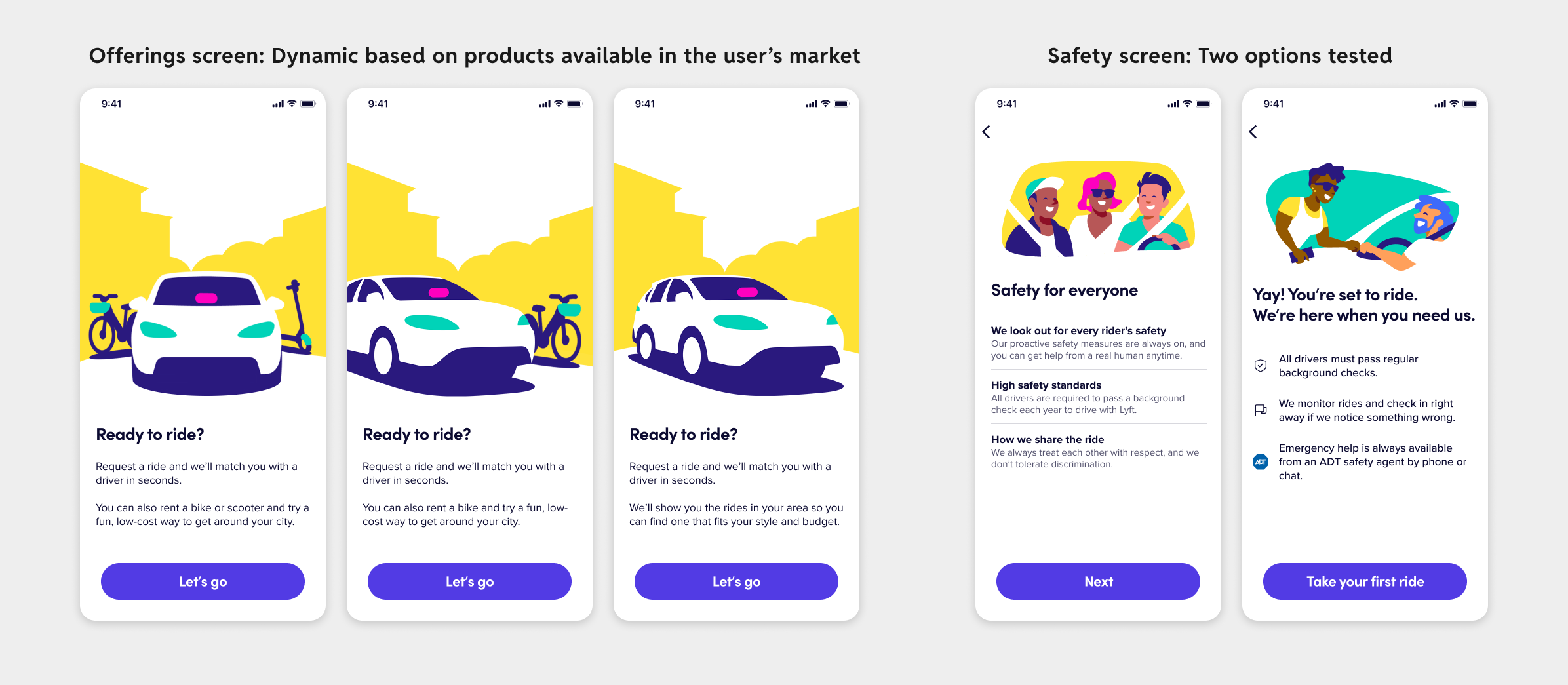
Testing the offerings screen against the safety screen revealed that users perceived the offerings screen as Lyft advertising its own products. On the other hand, the safety screen’s firm commitment at the end of the flow increased their confidence in the platform as a whole.
So the second peak moment became Lyft’s safety promise. The content design here was doing most of the heavy lifting to brand this as a peak moment and instill rider confidence going into the first ride booking flow. The initial research and concept tests were critical in making the right call here (shout out to Sabrina Papazian).
The final revamped flow
The two peak moments combined with the automations completed the flow. Despite looking simple, there was a lot of hidden complexity here. There were dozens of branching paths users could end up in and we had multiple experiment variants on top of that. Shout out to my core design team made up of Kevin Huang and Sneha Mulki for carrying out the bulk of the design execution work here.
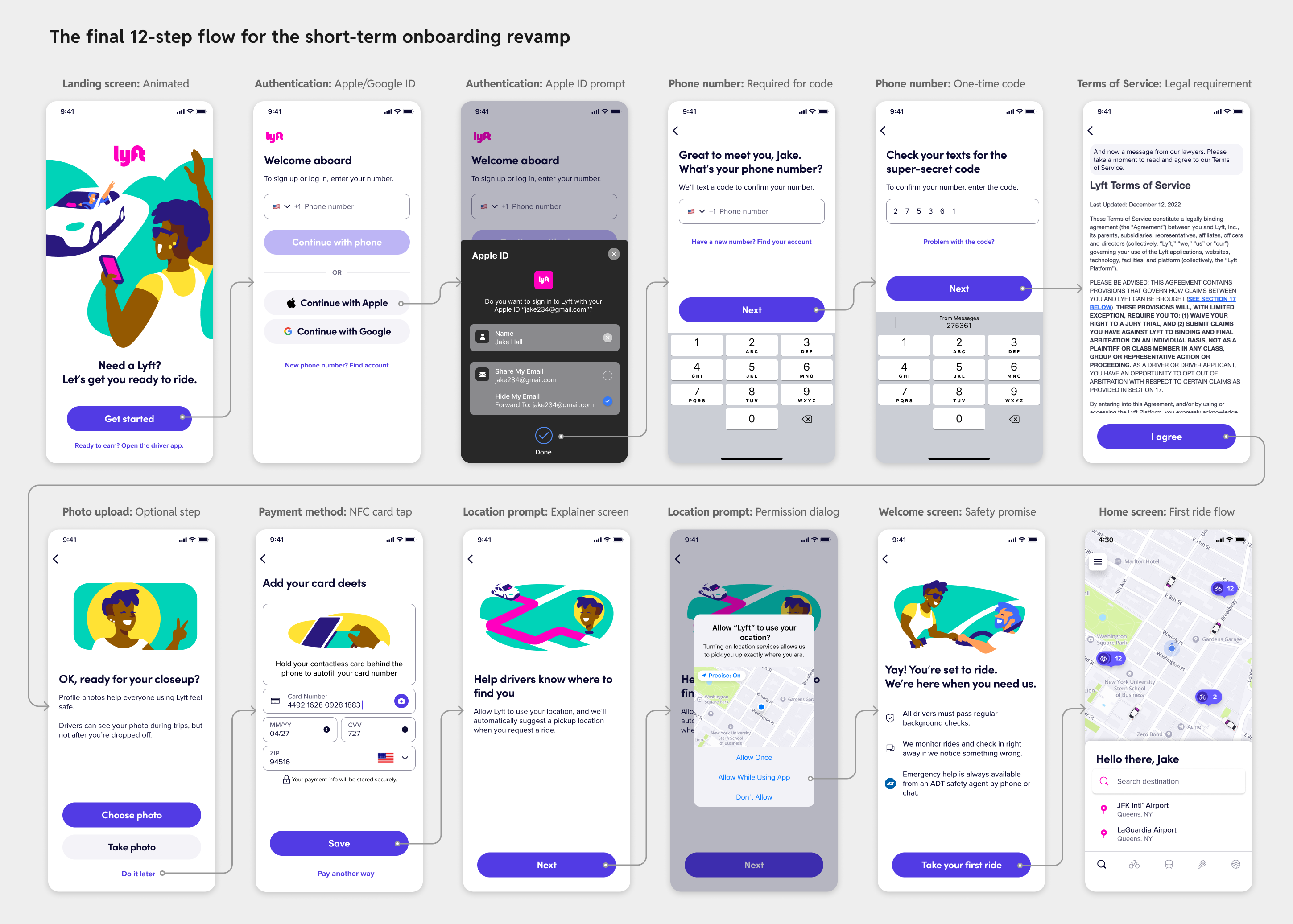
The ID upload flow came with its own slew of privacy concerns and high friction in the form of needing to pull out your ID or hunt for a picture of it on your phone, so we reverted back to the photo upload flow with more encouraging copy. A huge part of what made this flow feel delightful and fun is the content design, so a big shout out to Tom Berman for nailing the tone and voice of this flow.
After some final legal reviews, the new flow began rolling out in test markets. We saw higher rider activations, fewer drop-offs in the onboarding funnel, and increased conversion on the payment method step. This was also validated in research sessions where riders reported feeling more confident about riding with Lyft after having gone through the revamped flow.
Any onboarding flow that feels effortless is the result of a lot of behind-the-scenes optimizations, technical wizardry, and design delight. I’m proud of the fact that we managed to elevate our experience with specific peak moments and eliminated as many of the steps as we could to get to a final flow that felt fast, seamless, and empowering.